tencent cloud

Feedback

Form Component

Last updated: 2024-11-21 18:41:53

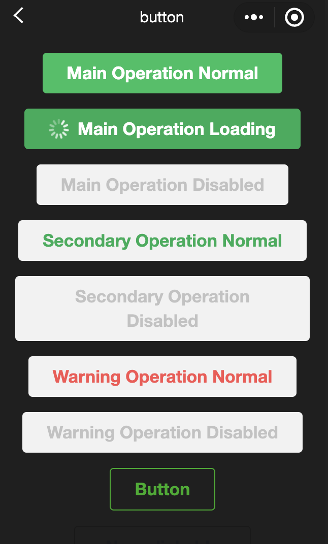
    button

    Feature Description: Button.
    Parameter and Description:
    Attribute name
    Type
    Valid Values and Descriptions
    Default value
    Required
    Note
    size
    string
    Default: Default size
    Mini: Small dimensions
    default
    No
    Dimensions of the button
    type
    string
    Primary: Green
    Default: White
    Warn: Red
    default
    No
    Aesthetic design of buttons
    plain
    boolean
    -
    false
    No
    The button's hollow design and background color
    disabled
    boolean
    -
    false
    No
    Whether to disable
    loading
    boolean
    -
    false
    No
    Presence of a loading icon preceding the name
    form-type
    string
    Submit: Submit the form
    Reset: Reset the form
    -
    No
    Used within the form component, a click will respectively trigger the submit/reset events of the form component.
    hover-class
    string
    -
    button-hover
    No
    Specifies the style class when pressing the button. When hover-class="none", there is no click status effect.
    hover-start-time
    number
    -
    20
    No
    The duration, in milliseconds, before the click-status appears upon holding down.
    hover-stay-time
    number
    -
    70
    No
    The duration, in milliseconds, for which the click-status is retained after the finger is released.

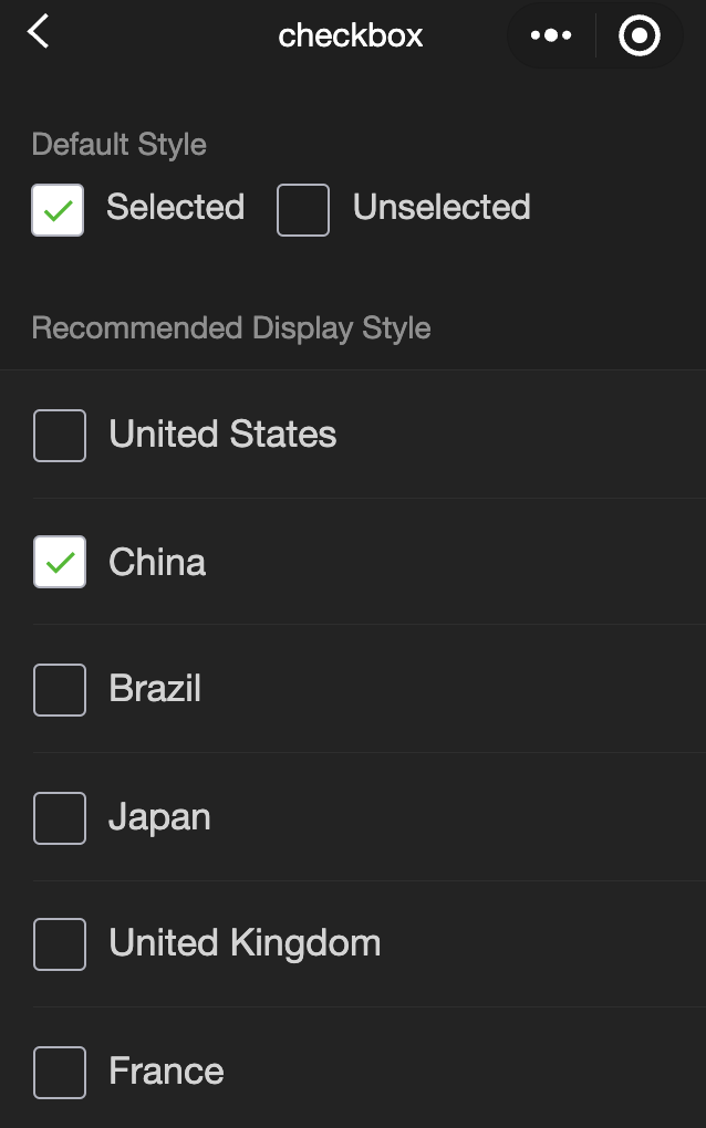
    checkbox

    Feature Description: Multiple selection items.
    Parameter and Description:
    Attribute name
    Type
    Default value
    Required
    Note
    value
    string
    -
    No
    Checkbox identifier, when selected, triggers the change event of the checkbox-group and carries the value of the checkbox.
    disabled
    boolean
    false
    No
    Whether to disable
    checked
    boolean
    false
    No
    Indicates whether it is currently selected, which can be used to set the default selection.
    color
    string
    #09BB07
    No
    The color of the checkbox, identical to the color in CSS.

    checkbox-group

    Feature Description: A multi-item selector, internally composed of multiple checkboxes.
    Attribute description:
    Attribute name
    Type
    Default value
    Required
    Note
    bindchange
    eventhandle
    -
    No
    When the selected item in the checkbox-group changes, it triggers the change event, detail = {value: [array of the selected checkbox's value]}.

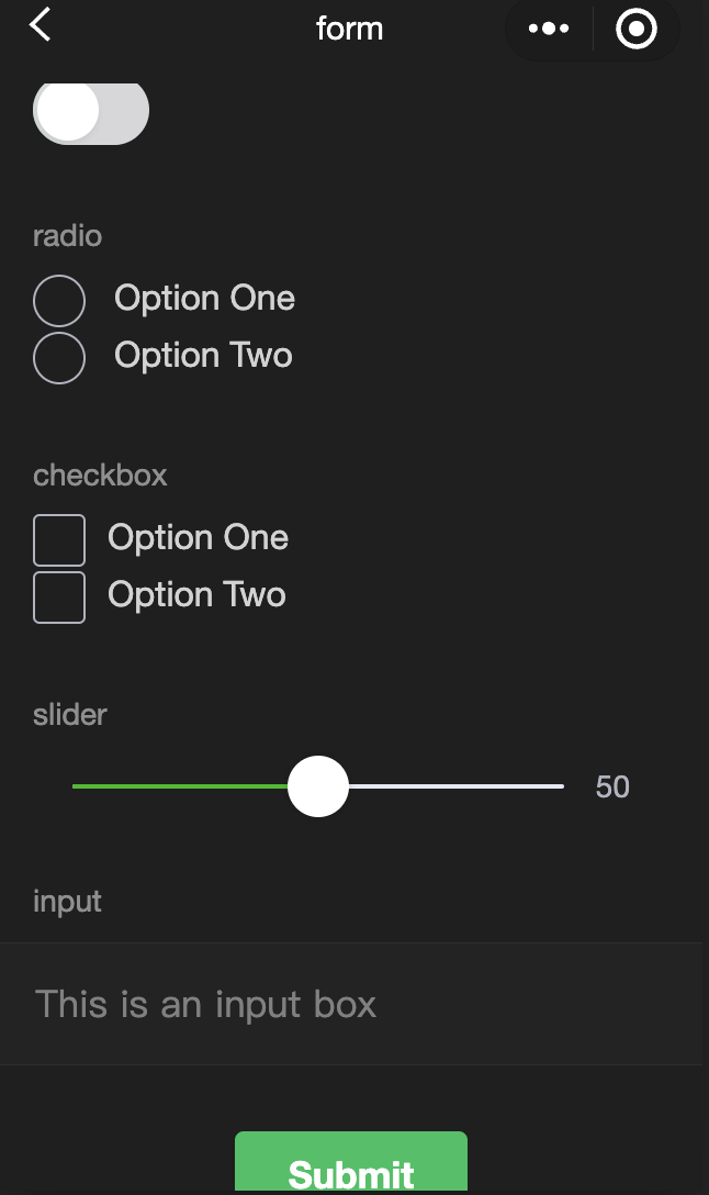
    form

    Feature Description: Form, used to submit the user's inputs within the component, namely the switch, input, checkbox, slider, radio, and picker.
    Upon clicking the button component in the form with a form-type of "submit", the value in the form component will be submitted, necessitating the addition of a name in the form component to serve as a key.
    Parameter and Description
    Attribute name
    Type
    Default value
    Required
    Note
    bindsubmit
    eventhandle
    -
    No
    Carries the data in the form to trigger the "submit" event, event.detail = {value : {'name': 'value'}, formId: ''}.
    bindreset
    eventhandle
    -
    No
    The reset event is triggered when the form is reset.

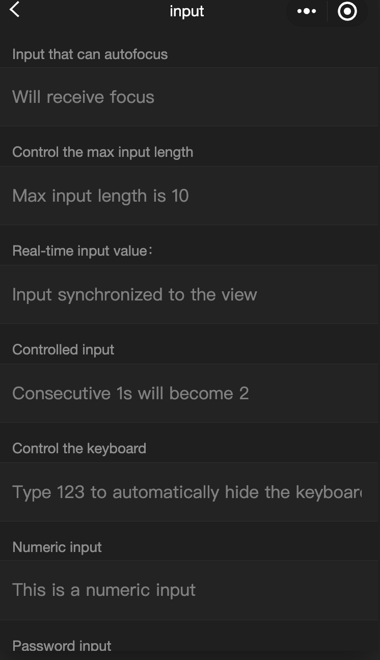
    input

    Feature Description: Input box. This component is a native component, so mind the relevant restrictions when using it.
    Parameter and Description
    Attribute name
    Type
    Valid Values and Descriptions
    Default value
    Required
    Note
    value
    string
    -
    -
    Yes
    The initial content of the input box.
    type
    string
    Text: Text input keyboard.
    Number: Numeric input keyboard.
    ID Card: ID number input keyboard.
    Digit: Numeric keyboard with decimal point.
    text
    No
    Type of input.
    password
    boolean
    -
    false
    No
    Is it a password type?
    placeholder
    string
    -
    
    Yes
    Placeholder when the input field is empty.
    placeholder-style
    string
    -
    -
    Yes
    Specify the style of the placeholder.
    placeholder-class
    string
    -
    input-placeholder
    No
    Specify the style class of the placeholder.
    disabled
    boolean
    -
    false
    No
    Whether to disable
    maxlength
    number
    -
    140
    No
    Maximum input length, unrestricted when set to -1.
    cursor-spacing
    number
    -
    0
    No
    Specify the distance between the cursor and the keyboard, taking the minimum value of the distance from the input to the bottom and the distance specified by cursor-spacing as the distance between the cursor and the keyboard.
    auto-focus
    boolean
    -
    false
    No
    (About to be deprecated, please use focus directly) Auto-focus, pull up the keyboard.
    focus
    boolean
    
    false
    No
    Get focus.
    bindinput
    eventhandle
    -
    -
    Yes
    Triggered upon keyboard inputs, event.detail = {value, cursor, keyCode}. keyCode is the key value, supported from version 2.1.0 onwards. The handler function can directly return a string, which will replace the content of the input box.
    bindfocus
    eventhandle
    -
    -
    Yes
    Triggered when the input box is focused, event.detail = { value, height }. Height represents the keyboard height, supported from base library version 1.9.90 onwards.
    bindblur
    eventhandle
    -
    -
    Yes
    Triggered when the input box loses focus, event.detail = { value, encryptedValue, encryptError }.
    bindconfirm
    eventhandle
    -
    -
    Yes
    Triggered when Done is clicked, event.detail = { value }.

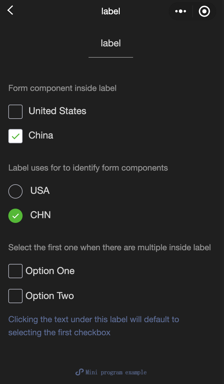
    label

    Feature Description: Used to enhance the usability of form components.
    Use the 'for' attribute to find the corresponding id, or place the control under this tag. When clicked, it will trigger the corresponding control. 'For' has a higher priority than internal controls. When there are multiple controls internally, the first control is triggered by default. The controls that can currently be bound are: button, checkbox, radio, switch, input.
    Parameter and Description:
    Attribute name
    Type
    Default value
    Required
    Note
    for
    string
    -
    No
    Bind with control ID

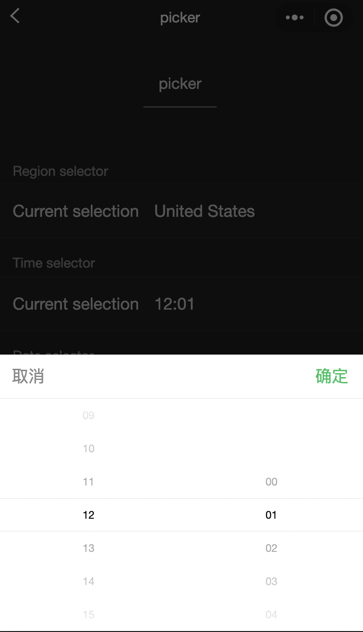
    picker

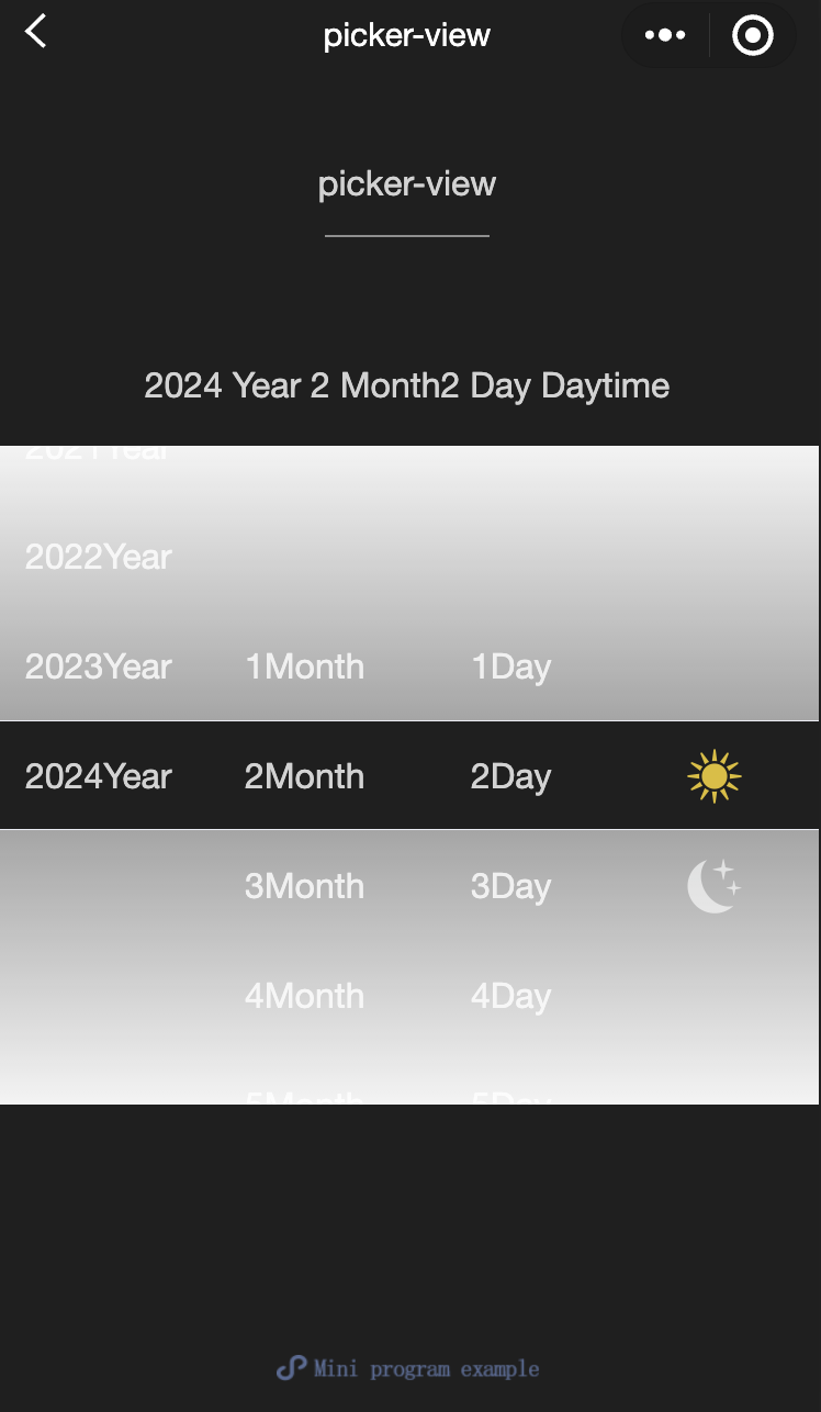
    Feature Description: A scrolling selector that pops up from the bottom.
    Attribute description:
    Attribute name
    Type
    Valid Values and Descriptions
    Default value
    Required
    Note
    mode
    string
    Selector: Regular selector.
    multiSelector: Multi-column selector.
    Time: Time selector.
    Date: Date selector.
    Region: Province, City, and District selector.
    selector
    No
    Selector Type
    disabled
    boolean
    -
    false
    No
    Whether to disable
    In addition to the aforementioned universal attributes, the picker possesses distinct attributes for different modes.

    Regular Selector: mode = selector.

    Attribute name
    Type
    Default value
    Note
    range
    array/object array
    []
    The range is valid when the mode is either selector or multiSelector.
    range-key
    string
    -
    When the range is an Object Array, the key value within the Object is specified as the selector display content via the range-key.
    value
    number
    0
    This represents the selection of the nth (starting from 0) element in the range.
    bindchange
    eventhandle
    -
    The change event is triggered when the value alters, with event.detail = {value}.

    Multi-column selector: mode = multiSelector

    Attribute name
    Type
    Default value
    Note
    range
    array/object array
    []
    The range is valid when the mode is either selector or multiSelector.
    range-key
    string
    -
    When the range is an Object Array, the key value within the Object is specified as the selector display content via the range-key.
    value
    array
    []
    This represents the selection of the nth (starting from 0) element in the range.
    bindchange
    eventhandle
    -
    The change event is triggered when the value alters, with event.detail = {value}.
    bindcolumnchange
    eventhandle
    -
    Triggered when the column changes.

    Time selector: mode = time

    Attribute name
    Type
    Default value
    Note
    value
    string
    -
    This represents the selected time, formatted as "hh:mm".
    start
    string
    -
    This signifies the commencement of the valid time range, formatted as a string "hh:mm".
    end
    string
    -
    This signifies the termination of the valid time range, formatted as a string "hh:mm".
    bindchange
    eventhandle
    -
    The change event is triggered when the value alters, with event.detail = {value}.

    Date selector: mode = date

    Attribute name
    Type
    Valid values and their descriptions
    Default value
    Note
    value
    string
    -
    The present day
    This represents the selected date, formatted as "YYYY-MM-DD".
    start
    string
    -
    -
    This denotes the commencement of the valid date range, formatted as a string "YYYY-MM-DD".
    end
    string
    -
    -
    This signifies the termination of the valid date range, formatted as a string "YYYY-MM-DD".
    fields
    string
    Year: The selector granularity is set to annual.
    Month: The selector granularity is set to monthly.
    Day: The selector granularity is set to daily.
    day
    Valid values are 'year', 'month', 'day', indicating the granularity of the selector.
    bindchange
    eventhandle
    -
    -
    The change event is triggered when the value alters, with event.detail = {value}.

    Province, city, and district selector: mode = region

    Attribute name
    Type
    Default value
    Note
    value
    Array
    []
    This represents the selected province, city, and district, with the default being the first value in each column.
    custom-item
    string
    -
    A custom item can be added to the top of each column.
    bindchange
    evenhandle
    -
    When the 'value' changes, it triggers the 'change' event, with event.detail = {value: value, code: code, postcode: postcode}. Here, the 'code' field is the statistical division code, and 'postcode' is the postal code.
    bindcancel
    evenhandle
    -
    Triggered when a selection is canceled.
    disabled
    boolean
    false
    Whether to disable

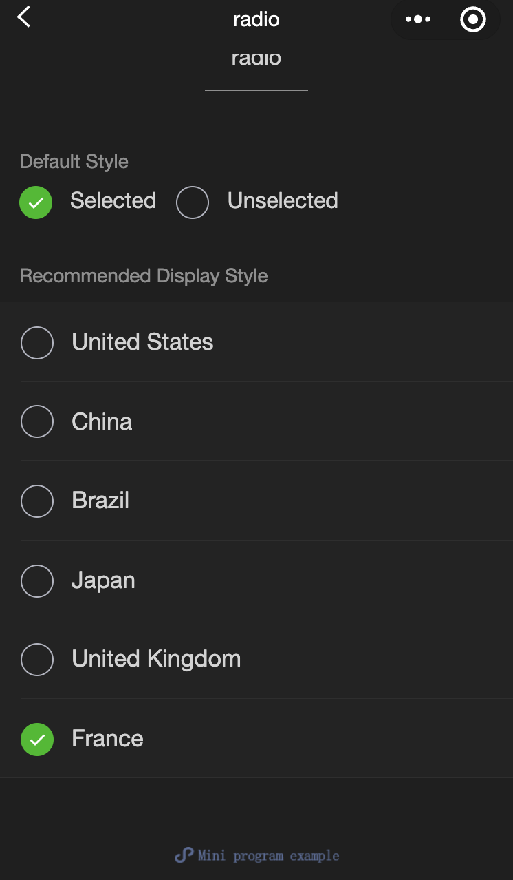
    radio

    Feature Description: Single selection item.
    Parameter and Description
    Attribute name
    Type
    Default value
    Required
    Note
    value
    string
    -
    No
    Radio identifier. When this radio is selected, the 'change' event of the radio-group will carry the value of the radio.
    checked
    boolean
    false
    No
    Whether it is currently selected.
    disabled
    boolean
    false
    No
    Whether to disable
    color
    string
    #09BB07
    No
    The color of the radio, consistent with the CSS color.

    radio-group

    Feature Description: Single-item selector, internally composed of multiple radio elements.
    Parameter and Description
    Attribute name
    Type
    Default value
    Required
    Note
    bindchange
    eventhandle
    -
    No
    When the selected item in the radio-group changes, it triggers the 'change' event, with detail = {value: [array of the selected radio's value]}.

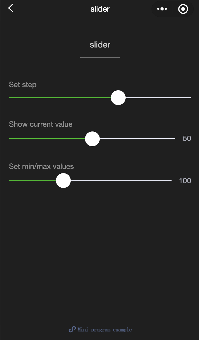
    slider

    Feature Description: Slide selector.
    Parameter and Description
    Attribute name
    Type
    Default value
    Required
    Note
    min
    number
    0
    No
    Minimum value
    max
    number
    100
    No
    Maximum value
    step
    number
    1
    No
    Step size, whose value must be greater than 0 and divisible by (max - min).
    disabled
    boolean
    false
    No
    Whether to disable
    value
    number
    0
    No
    Current value
    color
    color
    #e9e9e9
    No
    Color of the background bar (use the backgroundColor)
    selected-color
    color
    #1aad19
    No
    Selected color (use the activeColor)
    activeColor
    color
    #1aad19
    No
    Selected color
    backgroundColor
    color
    #e9e9e9
    No
    Color of the background bar
    show-value
    boolean
    false
    No
    Whether to display the current value
    bindchange
    eventhandle
    -
    No
    Event triggered upon completion of a single drag, event.detail = {value}
    block-size
    number
    28
    No
    Slider size, ranging from 12 to 28
    block-color
    color
    #ffffff
    No
    Slider color

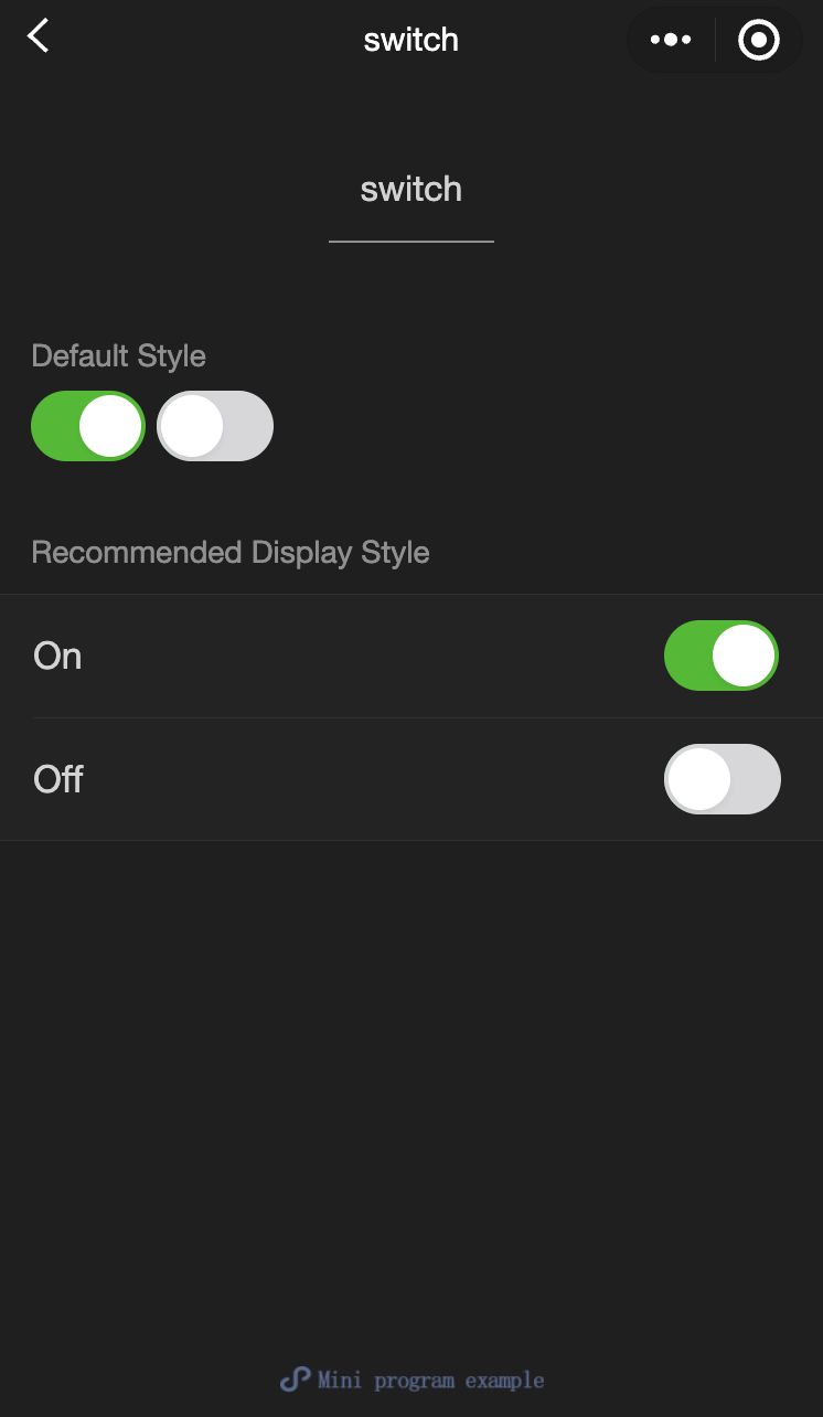
    switch

    Feature Description: Switch selector.
    Parameter and Description
    Attribute name
    Type
    Default value
    Required
    Note
    checked
    boolean
    false
    No
    Selection status
    disabled
    boolean
    false
    No
    Whether to disable
    type
    string
    switch
    No
    Style, whose valid values include switch and checkbox.
    color
    string
    #04BE02
    No
    Color of the switch, the same as the CSS color
    bindchange
    eventhandle
    -
    No
    Triggering the change event when a click results in a modification of the checked status, event.detail={ value}

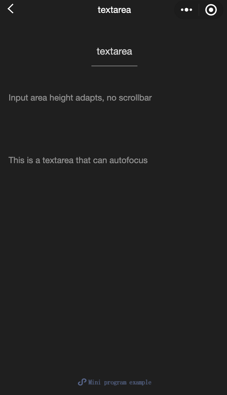
    textarea

    Feature Description: Multi-line input box. This component is a native component, so mind the relevant restrictions when using it.
    Parameter and Description:
    Attribute name
    Type
    Valid Values and Descriptions
    Default value
    Required
    Note
    value
    string
    -
    -
    No
    The content of the input box.
    placeholder
    string
    -
    -
    No
    Placeholder when the input field is empty.
    placeholder-style
    string
    -
    -
    No
    Specify the style of the placeholder, currently only supporting color, font-size, and font-weight.
    placeholder-class
    string
    -
    textarea-placeholder
    No
    Specify the style class of the placeholder.
    disabled
    boolean
    -
    false
    No
    Whether to disable
    maxlength
    number
    -
    140
    No
    Maximum input length, unrestricted when set to -1.
    auto-focus
    boolean
    -
    false
    No
    Automatic focus, invoking the keyboard.
    focus
    boolean
    -
    false
    No
    Get focus.
    auto-height
    boolean
    -
    false
    No
    Whether to automatically increase in height, when auto-height is set, style.height will not take effect.
    cursor
    number
    -
    -1
    No
    Specify the cursor position when focus is applied.
    selection-start
    number
    -
    -1
    No
    Cursor starting position, effective when automatically focused, which must be used in conjunction with selection-end.
    selection-end
    number
    -
    -1
    No
    Cursor ending position, effective when automatically focused, which must be used in conjunction with selection-start.
    confirm-type
    string
    Send: The button in the bottom right corner is labeled "Send".
    Search: The button in the bottom right corner is labeled "Search".
    Next: The button in the bottom right corner is labeled "Next".
    Go: The button in the bottom right corner is labeled "Go".
    Done: The button in the bottom right corner is labeled "Done".
    Return: The button in the bottom right corner is labeled "Return".
    return
    No
    Set the text of the button in the bottom right corner of the keyboard.
    confirm-hold
    boolean
    -
    false
    No
    Should the keyboard remain open when the button in the bottom right corner is clicked?
    
    Contact Us

    Contact our sales team or business advisors to help your business.

    Technical Support

    Open a ticket if you're looking for further assistance. Our Ticket is 7x24 avaliable.

    7x24 Phone Support