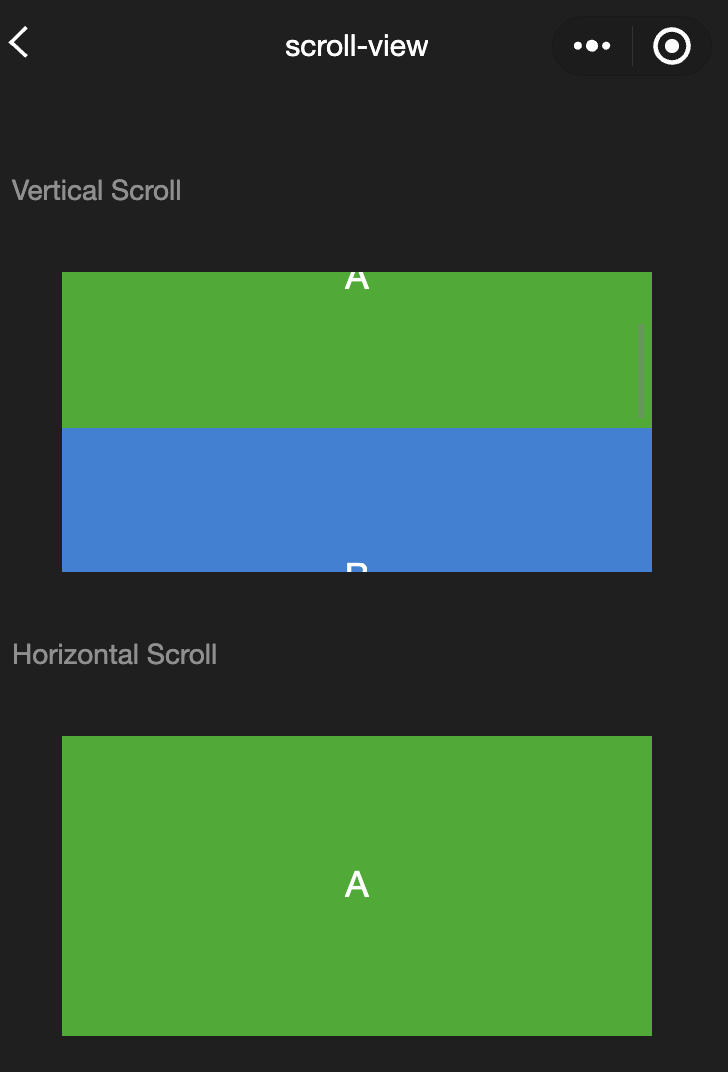
Feature description:A scrollable view area. When using vertical scrolling, you need to give the<scroll-view>a fixed height, which can be set using WeiXin Style Sheets (WXSS).
Parameter and description:
|
scroll-x | boolean | false | Allows horizontal scrolling. |
scroll-y | boolean | false | Allows vertical scrolling. |
upper-threshold | number/string | 50 | Distance from the top/left to trigger scrolltoupper. |
lower-threshold | number/tring | 50 | Distance from the bottom/right to trigger scrolltolower. |
scroll-top | number/string | - | Sets the vertical scroll bar position. |
scroll-left | number/string | - | Sets the horizontal scroll bar position. |
scroll-into-view | string | - | The value should be the id of a child element (id cannot start with a number). Scrolls to the element in the specified direction. |
scroll-with-animation | boolean | false | Uses animation when setting the scroll bar position. |
enable-back-to-top | boolean | false | On iOS, returns to the top when the status bar is tapped; on Android, returns to the top when the title bar is double-tapped. Only supports vertical scrolling. |
refresher-enabled | boolean | false | Enables custom pull-down refresh. |
refresher-threshold | number | 45 | Sets the custom pull-down refresh threshold. |
refresher-default-style | string | black | Sets the default style for custom pull-down refresh. Options are black | white | none, none means no default style. |
refresher-background | string | - | Sets the background color for the custom pull-down refresh area, default is transparent. |
refresher-triggered | boolean | false | Sets the current pull-down refresh state. True means pull-down refresh has been triggered, false means it has not. |
bounces | boolean | true | Controls the scroll-view boundary elasticity on iOS (effective when the enhanced property is enabled). |
show-scrollbar | boolean | true | Controls the visibility of the scroll bar (effective when the enhanced property is enabled). |
fast-deceleration | boolean | false | Controls the sliding deceleration rate, only effective on iOS (effective when the enhanced property is enabled). |
binddragstart | eventhandle | - | Triggered when sliding starts (effective when the enhanced property is enabled). detail { scrollTop, scrollLeft } |
binddragging | eventhandle | - | Triggered during sliding (effective when the enhanced property is enabled). detail { scrollTop, scrollLeft } |
binddragend | eventhandle | - | Triggered when sliding ends (effective when the enhanced attribute is enabled). detail { scrollTop, scrollLeft, velocity } |
bindscrolltoupper | eventhandle | - | Triggered when scrolled to the top/left |
bindscrolltolower | eventhandle | - | Triggered when scrolled to the bottom/right |
bindscroll | eventhandle | - | Triggered during scrolling. event.detail = {scrollLeft, scrollTop, scrollHeight, scrollWidth, deltaX, deltaY} |
scroll-anchoring | boolean | false | Enables scroll anchoring, which adjusts the scroll position to compensate for the changes outside of the viewport. Only effective on iOS. For Android, refer to the Cascading Style Sheets (CSS)overflow-anchor property. |
enhanced | boolean | false | Enables enhanced features for scroll-view. When enabled, you can operate the scroll-view through ScrollViewContext. |
paging-enabled | boolean | false | Enables paging effect (effective when the enhanced property is enabled) |
Notes:
The length of the scroll bar is estimated. If the height differences among direct child nodes are significant, the scroll bar length might be inaccurate.
Do not use textarea, map, canvas, or video components within a scroll-view.
The scroll-into-view has a higher priority than scroll-top.
Scrolling within a scroll-view will prevent the page from bouncing back, so onPullDownRefresh cannot be triggered within a scroll-view.
To use pull-down refresh, use the page's scrolling instead of scroll-view. This also allows returning to the top of the page by tapping the top status bar.
Example:
<view class="container">
<view class="page-body">
<view class="page-section">
<view class="page-section-title">
<text>Vertical Scroll</text>
</view>
<view class="page-section-spacing">
<scroll-view scroll-y="true" style="height: 300rpx;" bindscrolltoupper="upper" bindscrolltolower="lower" bindscroll="scroll" scroll-into-view="{{toView}}" scroll-top="{{scrollTop}}">
<view id="demo1" class="scroll-view-item demo-text-1"></view>
<view id="demo2" class="scroll-view-item demo-text-2"></view>
<view id="demo3" class="scroll-view-item demo-text-3"></view>
</scroll-view>
</view>
</view>
<view class="page-section">
<view class="page-section-title">
<text>Horizontal Scroll</text>
</view>
<view class="page-section-spacing">
<scroll-view class="scroll-view_H" scroll-x="true" bindscroll="scroll" style="width: 100%">
<view id="demo1" class="scroll-view-item_H demo-text-1"></view>
<view id="demo2" class="scroll-view-item_H demo-text-2"></view>
<view id="demo3" class="scroll-view-item_H demo-text-3"></view>
</scroll-view>
</view>
</view>
</view>
</view>
const order = ['demo1', 'demo2', 'demo3']
Page({
onShareAppMessage() {
return {
title: 'scroll-view',
path: 'page/component/pages/scroll-view/scroll-view'
}
},
data: {
toView: 'green'
},
upper(e) {
console.log(e)
},
lower(e) {
console.log(e)
},
scroll(e) {
console.log(e)
},
scrollToTop() {
this.setAction({
scrollTop: 0
})
},
tap() {
for (let i = 0; i < order.length; ++i) {
if (order[i] === this.data.toView) {
this.setData({
toView: order[i + 1],
scrollTop: (i + 1) * 200
})
break
}
}
},
tapMove() {
this.setData({
scrollTop: this.data.scrollTop + 10
})
}
})
.page-section-spacing{
margin-top: 60rpx;
}
.scroll-view_H{
white-space: nowrap;
}
.scroll-view-item{
height: 300rpx;
}
.scroll-view-item_H{
display: inline-block;
width: 100%;
height: 300rpx;
}
swiper
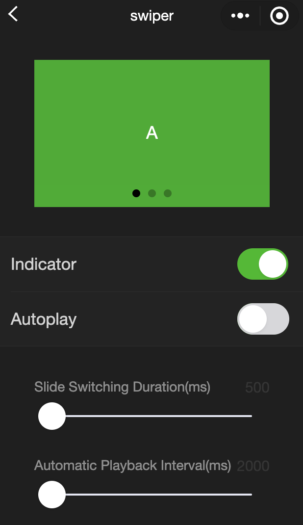
Feature description:A swiper view container.The change event returns a detail object that includes a source field, indicating the cause of the change. Possible values are:
autoplay:The swiper changed due to automatic playback.
touch:The swiper changed due to user swiping.
An empty string indicates other reasons.
Parameter and description:
|
indicator-dots | boolean | false | Specifies whether to show panel indicator dots. |
indicator-color | color | rgba(0, 0, 0, .3) | Color of the indicator dots. |
indicator-active-color | color | #000000 | Color of the currently selected indicator dot. |
autoplay | boolean | false | Specifies whether to enable automatic switching. |
current | number | 0 | Index of the current slide |
current-item-id | String | "" | Item-id of the current slide, cannot be specified simultaneously with current. |
interval | number | 5,000 | Time interval for automatic switching (in ms). |
duration | number | 500 | Duration of the sliding animation (in ms). |
circular | boolean | false | Specifies whether to enable circular swipe. |
vertical | boolean | false | Specifies whether to enable vertical swipe |
display-multiple-items | number | 1 | Number of items displayed simultaneously |
previous-margin | string | "0px" | Margin before the current item, can be used to partially show the previous item. Accepts pixel and responsive pixel values. |
easing-function | string | default | Specifies the easing animation type for swiper transitions. Valid values are: default: Default easing function.
linear: Linear animation.
easeInCubic: Ease-in animation.
easeOutCubic: Ease out animation.
easeInOutCubic: Ease in and out animation.
|
next-margin | string | "0px" | Margin after the current item, can be used to partially show the next item. Accepts pixel and responsive pixel values. |
bindchange | eventhandle | - | Triggered when current changes. event.detail = {current: current, source: source} |
bindtransition | eventhandle | - | Triggered when the position of a swiper-item changes. event.detail = {dx: dx, dy: dy} |
bindanimationfinish | eventhandle | - | The animationfinish event is triggered when the animation ends. event.detail is the same as above |
skip-hidden-item-layout | boolean | false | Whether to skip the layout of hidden items. Setting this to true can optimize swiping performance in complex scenarios but will lose the layout information of hidden items. |
Notes:
Only swiper-item components can be placed inside a swiper. Placing other components may result in undefined behavior. If you use setData to change the current value within the bindchange event callback, it may cause setData to be called repeatedly. Therefore, it is generally recommended to check the source field before changing the current value to determine if the change was caused by user touch.
Example:
<view class="container">
<view class="page-body">
<view class="page-section page-section-spacing swiper">
<swiper indicator-dots="{{indicatorDots}}"
autoplay="{{autoplay}}" interval="{{interval}}" duration="{{duration}}">
<block wx:for="{{background}}" wx:key="*this">
<swiper-item>
<view class="swiper-item {{item}}"></view>
</swiper-item>
</block>
</swiper>
</view>
<view class="page-section" style="margin-top: 40rpx;margin-bottom: 0;">
<view class="weui-cells weui-cells_after-title">
<view class="weui-cell weui-cell_switch">
<view class="weui-cell__bd">Indication Point</view>
<view class="weui-cell__ft">
<switch checked="{{indicatorDots}}" bindchange="changeIndicatorDots" />
</view>
</view>
<view class="weui-cell weui-cell_switch">
<view class="weui-cell__bd">Autoplay</view>
<view class="weui-cell__ft">
<switch checked="{{autoplay}}" bindchange="changeAutoplay" />
</view>
</view>
</view>
</view>
<view class="page-section page-section-spacing">
<view class="page-section-title">
<text>Slide switching duration (ms)</text>
<text class="info">{{duration}}</text>
</view>
<slider bindchange="durationChange" value="{{duration}}" min="500" max="2000"/>
<view class="page-section-title">
<text>Automatic playback interval duration (ms)</text>
<text class="info">{{interval}}</text>
</view>
<slider bindchange="intervalChange" value="{{interval}}" min="2000" max="10000"/>
</view>
</view>
</view>
Page({
onShareAppMessage() {
return {
title: 'swiper',
path: 'page/component/pages/swiper/swiper'
}
},
data: {
background: ['demo-text-1', 'demo-text-2', 'demo-text-3'],
indicatorDots: true,
vertical: false,
autoplay: false,
interval: 2000,
duration: 500
},
changeIndicatorDots() {
this.setData({
indicatorDots: !this.data.indicatorDots
})
},
changeAutoplay() {
this.setData({
autoplay: !this.data.autoplay
})
},
intervalChange(e) {
this.setData({
interval: e.detail.value
})
},
durationChange(e) {
this.setData({
duration: e.detail.value
})
}
})
swiper-item
Feature description:Can only be placed in a swiper component. Its width and height are automatically set to 100%. Parameter and description:
|
item-id | string | "" | Identifier of the swiper-item. |
view
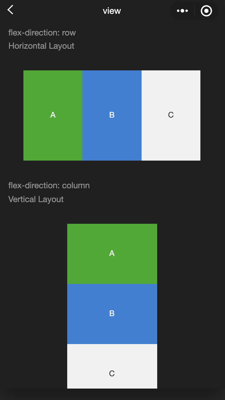
Feature description:A view container.
Parameter and description:
|
hover-class | string | - | Specifies the style class when tapped. No tap effect if hover-class="none". |
hover-stop-propagation | boolean | false | Specifies whether to prevent ancestor nodes from showing the tap effect. |
hover-start-time | number | 50 | Time in milliseconds before the tap effect appears after pressing. |
hover-stay-time | number | 400 | Time in milliseconds the tap effect remains after the finger is released. |
Notes:
If you need to use a scroll view, please use scroll-view. Example:
<view class="container">
<view class="page-body">
<view class="page-section">
<view class="page-section-title">
<text>flex-direction: row\nHorizontal layout</text>
</view>
<view class="page-section-spacing">
<view class="flex-wrp" style="flex-direction:row;">
<view class="flex-item demo-text-1"></view>
<view class="flex-item demo-text-2"></view>
<view class="flex-item demo-text-3"></view>
</view>
</view>
</view>
<view class="page-section">
<view class="page-section-title">
<text>flex-direction: column\nVertical layout</text>
</view>
<view class="flex-wrp" style="flex-direction:column;">
<view class="flex-item flex-item-V demo-text-1"></view>
<view class="flex-item flex-item-V demo-text-2"></view>
<view class="flex-item flex-item-V demo-text-3"></view>
</view>
</view>
</view>
</view>
movable-area
Feature description: Defines the movable area for movable-view . Parameter and description:
|
scale-area | boolean | false | When the movable-view is set to support pinch-to-zoom, setting this value will make the zoom gesture effective for the entire movable-area. |
Notes:
The movable-area must have width and height attributes set. If not set, the default value is 10px.
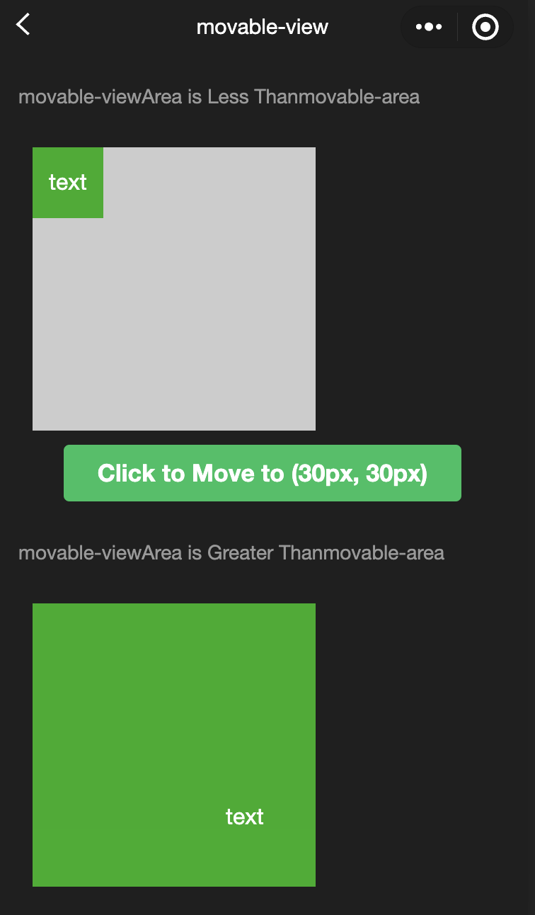
When movable-view is smaller than movable-area, the moving range of movable-view is within movable-area.
When movable-view is larger than movable-area, the movement range of movable-view must encompass the movable-area (considering the x-axis and y-axis separately).
Example:
<view class="container">
  <view class="page-body">    <view class="page-section">      <view class="page-section-title first">The movable-view area is smaller than the movable-area</view>      <movable-area>        <movable-view x="{{x}}" y="{{y}}" direction="all">text</movable-view>      </movable-area>    </view>    <view class="btn-area">      <button bindtap="tap" class="page-body-button" type="primary">Tap to move to (30px, 30px)</button>    </view>
    <view class="page-section">      <view class="page-section-title">The movable-view area is larger than the movable-area</view>      <movable-area>        <movable-view class="max" direction="all">text</movable-view>      </movable-area>    </view>
    <view class="page-section">      <view class="page-section-title">Only horizontal movement allowed</view>      <movable-area>        <movable-view direction="horizontal">text</movable-view>      </movable-area>    </view>
    <view class="page-section">      <view class="page-section-title">Only vertical movement allowed</view>      <movable-area>        <movable-view direction="vertical">text</movable-view>      </movable-area>    </view>
    <view class="page-section">      <view class="page-section-title">Allow out of bounds</view>      <movable-area>        <movable-view direction="all" out-of-bounds>text</movable-view>      </movable-area>    </view>
    <view class="page-section">      <view class="page-section-title">With inertia</view>      <movable-area>        <movable-view direction="all" inertia>text</movable-view>      </movable-area>    </view>
    <view class="page-section">      <view class="page-section-title">Scalable</view>      <movable-area scale-area>        <movable-view direction="all" bindchange="onChange" bindscale="onScale" scale scale-min="0.5" scale-max="4" scale-value="{{scale}}">text</movable-view>      </movable-area>    </view>
    <view class="btn-area">      <button bindtap="tap2" class="page-body-button" type="primary">Tap to zoom in 3 times</button>    </view>  </view>
</view>
Page({
onShareAppMessage() {
return {
title: 'movable-view',
path: 'page/component/pages/movable-view/movable-view'
}
},
data: {
x: 0,
y: 0,
scale: 2,
},
tap() {
this.setData({
x: 30,
y: 30
})
},
tap2() {
this.setData({
scale: 3
})
},
onChange(e) {
console.log(e.detail)
},
onScale(e) {
console.log(e.detail)
}
})
movable-view
Feature description:A movable view container that can be dragged and slid within a page.movable-view must be a direct child of the movable-area component to be movable. Parameter and description:
|
direction | string | none | The direction in which the movable-view can move. Possible values are all, vertical, horizontal, and none. |
inertia | boolean | false | Whether the movable-view has inertia. |
out-of-bounds | boolean | false | Whether the movable-view can move beyond the movable area. |
x | number/string | 0 | Defines the x-axis offset. If the value is out of the movable range, it will automatically move to the nearest valid position. Changing this value triggers an animation. |
y | number/string | 0 | Defines the y-axis offset. If the value is out of the movable range, it will automatically move to the nearest valid position. Changing this value triggers an animation. |
damping | number | 20 | The damping coefficient, which controls the animation when x or y changes and the bounce-back animation when out of bounds. The larger the value, the faster the movement. |
friction | number | 2 | The friction coefficient, which controls the animation of inertial sliding. The larger the value, the greater the friction and the quicker the stop. Must be greater than 0, otherwise it defaults to the set value. |
disabled | boolean | false | Whether the movable-view is disabled. |
scale | boolean | false | Whether the movable-view supports pinch-to-zoom. By default, the zoom gesture is effective within the movable-view. |
scale-min | number | 0.5 | Defines the minimum zoom scale. |
scale-max | number | 10 | Defines the maximum zoom scale. |
scale-value | number | 1 | Defines the zoom scale, with a range of 0.5 to 10. |
animation | boolean | true | Whether to use animation when changing the zoom scale. |
bindchange | eventhandle | - | Events triggered during dragging, event.detail = {x: x, y: y, source: source}, where source indicates the reason for the movement. Possible values are: touch: Dragging.
touch-out-of-bounds: Out of bounds.
out-of-bounds: Rebound back after out of bounds.
friction: Inertia.
Empty string: setData.
|
bindscale | eventhandle | - | Event triggered during scaling. event.detail = {x: x, y: y, scale: scale} |
In addition to basic events, movable-view provides two special events.
|
htouchmove | eventhandle | Triggered when the initial finger touch moves horizontally. Catching this event also catches the touchmove event. |
vtouchmove | eventhandle | Triggered when the initial finger touch moves vertically. Catching this event also catches the touchmove event. |
Notes:
The movable-view must have width and height attributes set. If not set, the default value is 10px.
movable-view is positioned absolutely by default, with top and left properties set to 0px.
cover-image
Feature description:An image view that overlays native components, similar to cover-view. It can be nested within a cover-view . Parameter and description:
|
src | string | - | The path to the image. Supports temporary paths and network addresses. SVG、GIFandBASE64formats are not supported.
|
bindload | eventhandle | - | Event triggered when the image loads successfully. |
binderror | eventhandle | - | Event triggered when the image fails to load. |
cover-view
Parameter and description:
|
scroll-top | number / string | - | Sets the top scroll offset. This only takes effect when overflow-y: scroll is set, making it a scrollable element. |
Notes:
The event model follows the bubbling model but will not bubble up to native components.
It is recommended to wrap all text in cover-view tags to avoid layout issues.
Only basic positioning, layout, and text styles are supported. It does not support setting individual borders, background images, shadows, or overflow: visible.
It is recommended that child nodes do not overflow their parent nodes.
You can't use z-index to control the stacking order.
The default styles include: white-space: nowrap; line-height: 1.2; display: block.
When nesting cover-view within custom components, the slot of the custom component and its parent nodes do not support visibility control via wx:if, as this will cause the cover-view to not display.
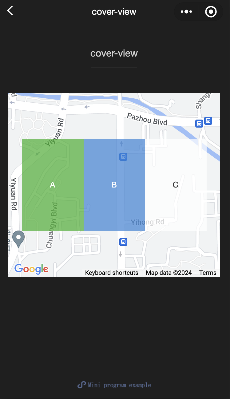
Example:
<view class="container">
<view class="page-body">
<view class="page-section page-section-gap">
<map
style="width: 100%; height: 300px;"
latitude="{{latitude}}"
longitude="{{longitude}}"
>
<cover-view class="cover-view">
<cover-view class="container">
<cover-view class="flex-wrp" style="flex-direction:row;">
<cover-view class="flex-item demo-text-1"></cover-view>
<cover-view class="flex-item demo-text-2"></cover-view>
<cover-view class="flex-item demo-text-3"></cover-view>
</cover-view>
</cover-view>
</cover-view>
</map>
</view>
</view>
</view>
Page({
onShareAppMessage() {
return {
title: 'cover-view',
path: 'page/component/pages/cover-view/cover-view'
}
},
data: {
latitude: 23.099994,
longitude: 113.324520,
}
})
.cover-view {
position: absolute;
top: calc(50% - 150rpx);
left: calc(50% - 300rpx);
}
.flex-wrp{
display:flex;
}
.flex-item{
width: 200rpx;
height: 300rpx;
font-size: 26rpx;
}
.demo-text-1 {
background: rgba(26, 173, 25, 0.7);
}
.demo-text-2 {
background: rgba(39, 130, 215, 0.7);
}
.demo-text-3 {
background: rgba(255, 255, 255, 0.7);
}


