
定制小程序 UI
最后更新时间:2025-07-04 17:33:32
定制小程序 UI
最后更新时间: 2025-07-04 17:33:32
小程序 SDK 开放了对小程序的部分原生 UI 效果的自定义能力,开发者可以按照下面的规范进行配置。
为了实现自定义小程序 UI,开发者需要继承并实现 AbsMiniUiProxy。示例代码如下:
@ProxyService(proxy = IMiniUiProxy.class)public class MiniUiProxyImpl extends AbsMiniUiProxy
注意:
必须使用
@ProxyService(proxy = IMiniUiProxy.class)注解自定义 UI。定制导航栏按钮
1. 返回按钮
返回按钮默认样式如下:
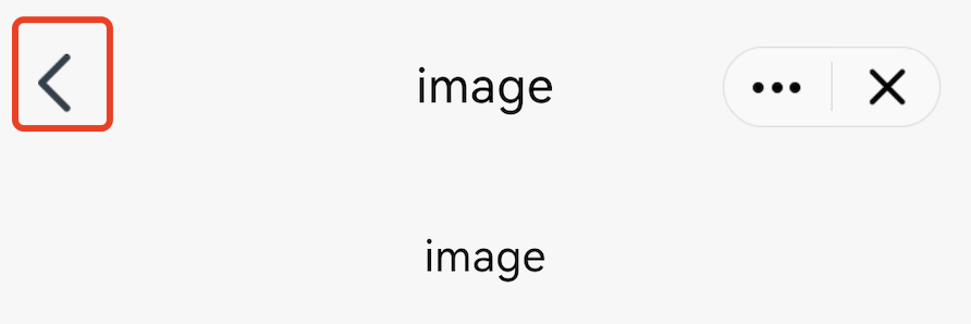
小程序 SDK 提供返回按钮自定义的功能,可以通过重写 AbsMiniUiProxy 的 navBarBackRes 方法实现。
API 定义如下:
方法参数 mode:表示导航栏标题颜色,1 表示黑色标题,0表示白色标题;
方法返回值:表示返回按钮的 icon资源ID。
/*** 自定义导航栏返回按钮icon, 尺寸要求=24x43* 调用环境:子进程** @param mode 导航栏标题颜色, 1:black 0:white* @return*/@DrawableResint navBarBackRes(int mode);
注意:
返回按钮 icon 资源的尺寸要求为:24x43。
示例代码:
@Override
public int navBarBackRes(int mode) {
    if(mode == 0) {//black
        return R.drawable.back_icon;//your black icon res
    }else {//white
        return R.drawable.white_icon;//your white icon res
    }
}
2. home按钮
home 按钮默认样式如下:
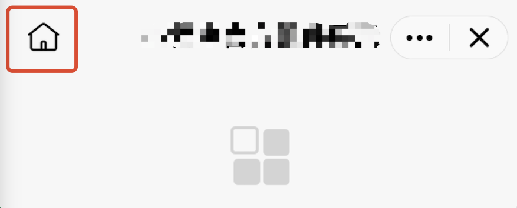
小程序 SDK 提供 home 按钮自定义的功能,可以通过重写 AbsMiniUiProxy 的 homeButtonRes 方法实现。
API 定义如下:
方法参数 mode:表示导航栏标题颜色,1 表示黑色标题,0表示白色标题;
方法返回值:表示home按钮的icon 资源 ID。
/*** 导航栏返回home按钮icon, 尺寸要求=48x48* 调用环境:子进程** @param mode 导航栏标题颜色, 1:black 0:white* @return*/@DrawableResint homeButtonRes(int mode);
注意:
尺寸要求:导航栏home按钮icon, 尺寸要求=48x48。
示例代码:
@Override
public int homeButtonRes(int mode) {

    if(mode == 0) {//black
        return R.drawable.home_black_icon;
    }else {
        return R.drawable.home_white_icon;
    }
}
3. 更多按钮
更多按钮默认样式如下:
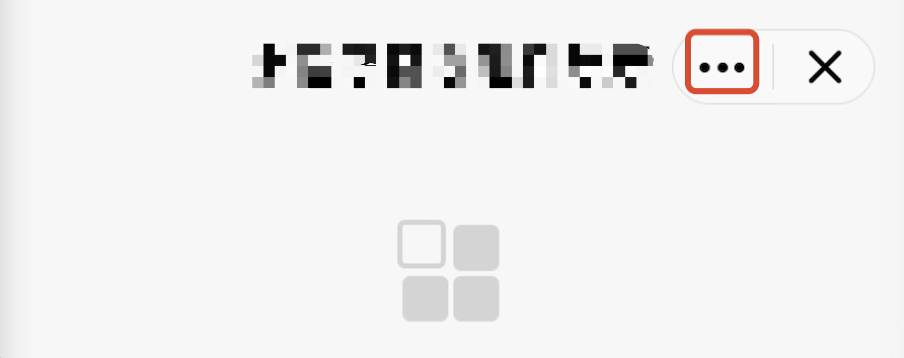
小程序 SDK 提供更多按钮自定义的功能,可以通过重写 AbsMiniUiProxy 的 moreButtonRes 方法实现。
API 定义如下:
方法参数 mode:表示导航栏标题颜色,1 表示黑色标题,0表示白色标题;
方法返回值:表示更多按钮的 icon 资源 ID。
/*** 导航栏更多按钮icon, 尺寸要求=80x59* 调用环境:子进程** @param mode 导航栏标题颜色, 1:black 0:white* @return*/@DrawableResint moreButtonRes(int mode);
注意:
尺寸要求:导航栏更多按钮 icon, 尺寸要求=80x59。
示例代码:
@Override
public int moreButtonRes(int mode) {

    if(mode == 0) {//black
        return R.drawable.more_black_icon;
    }else {
        return R.drawable.more_white_icon;
    }
}
4. 小程序关闭按钮
小程序关闭按钮默认样式如下:
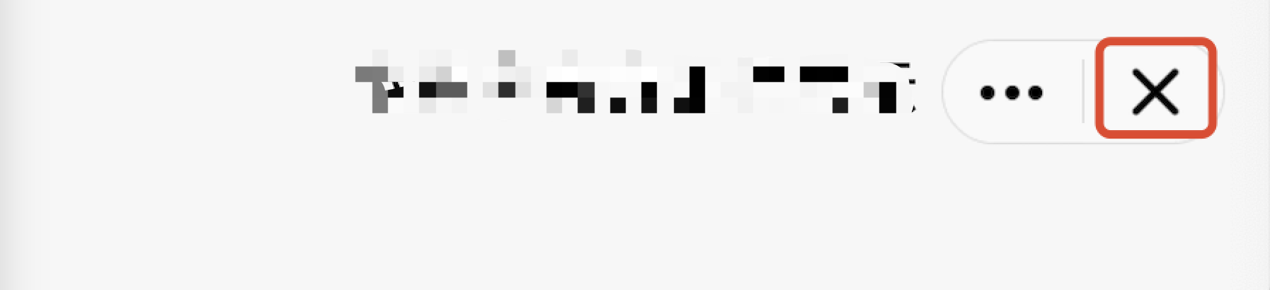
小程序 SDK 提供关闭按钮自定义的功能,可以通过如下方式实现:
自定义关闭按钮:
重写 AbsMiniUiProxy 的 closeButtonRes 方法。
API 定义如下:
API 说明:
方法参数 mode:表示导航栏标题颜色,1 表示黑色标题,0表示白色标题。
方法返回值:表示关闭按钮的 icon 资源 ID。
/*** 导航栏关闭按钮icon, 尺寸要求=80x59* 调用环境:子进程** @param mode 导航栏标题颜色, 1:black 0:white* @return*/@DrawableResint closeButtonRes(int mode);
注意:
尺寸要求:导航栏关闭按钮 icon, 尺寸要求=80x59。
示例代码:
@Override
public int closeButtonRes(int mode) {

    if(mode == 0) {//black
        return R.drawable.close_black_icon;
    }else {
        return R.drawable.close_white_icon;
    }
}
5. 胶囊按钮分割线
小程序胶囊按钮分割线默认样式如下:
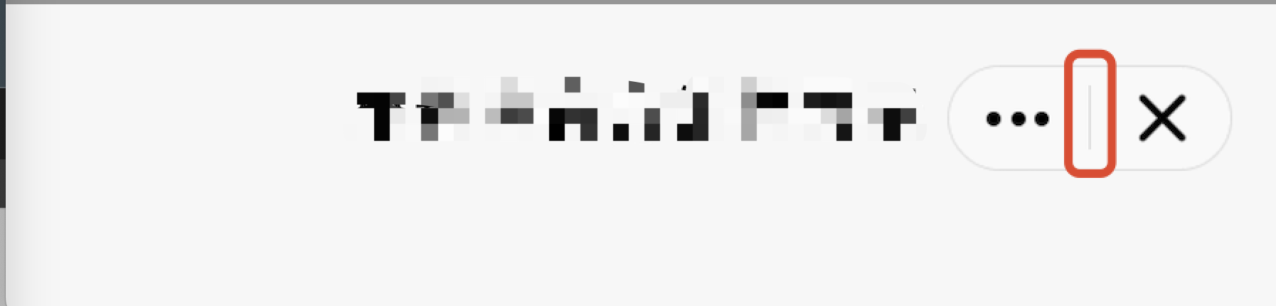
小程序 SDK 提供自定义胶囊按钮分割线的功能,可以通过重写 AbsMiniUiProxy 的 lineSplitBackgroundColor 方法实现。
API 定义如下:
方法返回值:表示分割线背景颜色。
/*** 胶囊按钮中间分割线背景颜色* 调用环境:子进程** @return*/@DrawableResint lineSplitBackgroundColor();
示例代码:
@Override
public int lineSplitBackgroundColor() {return Color.RED;
}
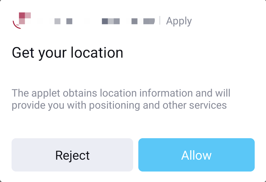
定制授权弹窗
当小程序调用的 API 需要授权时,SDK 提供如下默认的授权 UI 样式:
开发者也可以通过如下方法自定义授权 UI 样式。
自定义授权弹窗:
重写 AbsMiniUiProxy 的 authView 方法;
参数 Context 表示小程序进程的上下文;
参数 MiniAuthInfo 包含有当前小程序所请求的授权信息,详见 MiniAuthInfo;
参数 IAuthView,用于设置自定义的弹窗 View。
API 定义如下:
/*** 自定义授权弹窗view* 调用环境:子进程** @param context* @param authInfo* @param authView* @return true:自定义授权view;false:使用内置*/@Overridepublic boolean authView(Context context, MiniAuthInfo authInfo, IAuthView authView)
注意:
authView 方法的返回值表示是否使用自定义授权视图,返回值为 false 使用默认内置的授权视图,返回值为 true 使用自定义授权视图。
MiniAuthInfo 中的 refuseListener 和 grantListener 表示授权弹窗的监听,必须设置,否则会导致小程序授权异常。
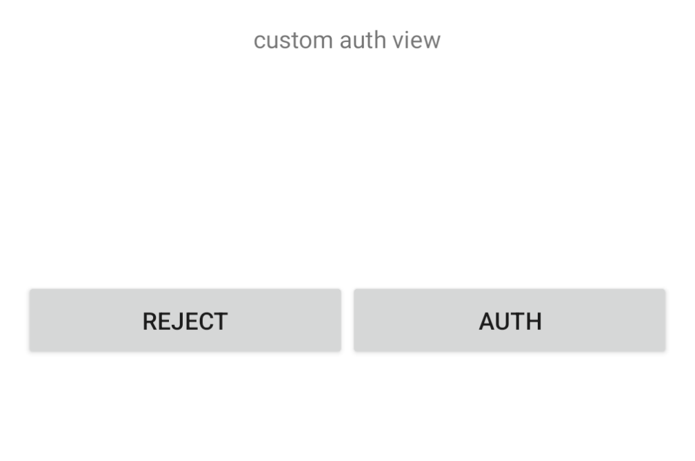
示例代码如下
视图布局文件
<?xml version="1.0" encoding="utf-8"?>
<RelativeLayout xmlns:android="http://schemas.android.com/apk/res/android"
    android:layout_width="match_parent"
    android:layout_height="match_parent"
    android:paddingLeft="16dp"
    android:paddingTop="16dp"
    android:paddingRight="16dp"
    android:paddingBottom="15dp"
    android:background="@android:color/white">

    <TextView
        android:layout_width="wrap_content"
        android:layout_height="wrap_content"
        android:text="custom auth view"
        android:layout_centerHorizontal="true"/>

    <LinearLayout
        android:layout_width="match_parent"
        android:layout_height="wrap_content"
        android:layout_marginTop="150dp">

        <Button
            android:id="@+id/mini_auth_btn_refuse"
            android:layout_width="match_parent"
            android:layout_height="wrap_content"
            android:layout_weight="1.0"
            android:text="@string/applet_mini_reject" />

        <Button
            android:id="@+id/mini_auth_btn_grant"
            android:layout_width="match_parent"
            android:layout_height="wrap_content"
            android:layout_weight="1.0"
            android:text="@string/applet_mini_auth" />
    </LinearLayout>

</RelativeLayout>
重写 authView 方法(注意方法返回值为 true):
@Override
public boolean authView(Context context, MiniAuthInfo authInfo, IAuthView authView) {
    boolean isCustom = true;
    if (isCustom) {
        View view = LayoutInflater.from(context).inflate(R.layout.mini_auth_view, null);
        //必须设置
        view.findViewById(R.id.mini_auth_btn_refuse).setOnClickListener(authInfo.refuseListener);
        //必须设置
        view.findViewById(R.id.mini_auth_btn_grant).setOnClickListener(authInfo.grantListener);

        //返回自定义View
        authView.getView(view);
    }

    return isCustom;
}
自定义效果:
定制小程序 Loading 视图
小程序打开过程中有检查更新和启动加载 Loading 动画,这两种 Loading 动画都支持自定义。
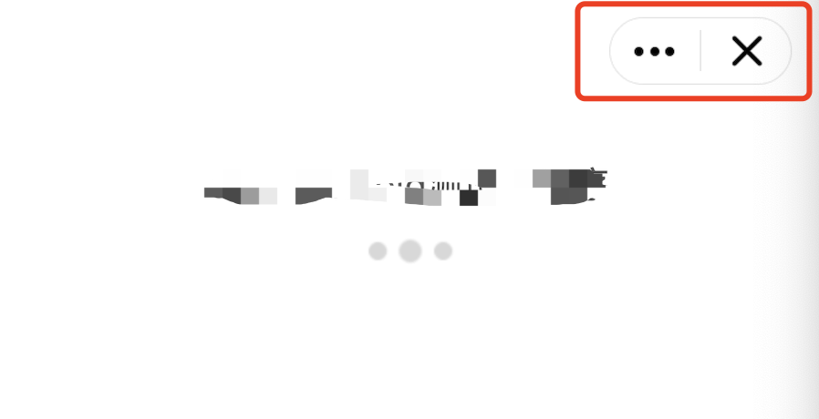
1. 定制小程序检查更新 Loading 视图
默认检查更新的 Loading 动画如下图所示:
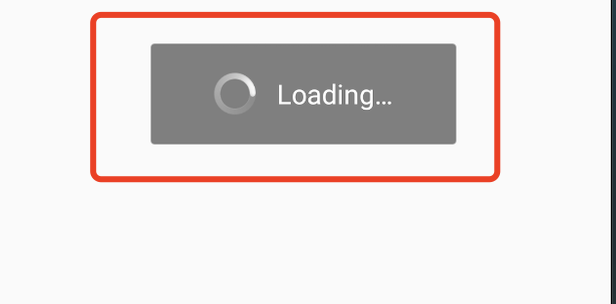
可以通过重写 AbsMiniUiProxy 的 updateLoadingView 方法实现。
API 描述如下:
说明:
updateLoadingView 方法的返回值是 IMiniLoading 类型的实例。
IMiniLoading的方法说明:
create 创建一个 Loading 视图;
show 展示 Loading 效果时回调;
stop 停止 Loading 效果时回调。
/*** 自定义小程序检查更新loading页面* 调用环境:主进程** @param context* @return*/public abstract IMiniLoading updateLoadingView(Context context);
示例代码:
@Overridepublic IMiniLoading updateLoadingView(Context context) {return new IMiniLoading() {@Overridepublic View create() {return LayoutInflater.from(context).inflate(R.layout.applet_activity_custom_update_loading, null);}@Overridepublic void show(View v) {}@Overridepublic void stop(View v) {}};}
2. 定制小程序加载 Loading 视图

可以通过重写 AbsMiniUiProxy 的 startLoadingView 方法实现。
API 描述如下:
说明:
startLoadingView 方法的返回值是 IMiniLoading 类型的实例。
IMiniLoading 的方法说明:
create 创建一个 Loading 视图;
show 展示 Loading 效果时回调;
stop 停止 Loading 效果时回调。
/*** 自定义小程序加载loading页面* 调用环境:子进程** @param activityWeakRef Activity引用* @param app 小程序信息* @return 返回小程序loading UI*/public abstract IMiniLoading startLoadingView(WeakReference<Activity> activityWeakRef, MiniAppLoading app);
示例代码:
@Overridepublic IMiniLoading startLoadingView(Context context) {return new IMiniLoading() {@Overridepublic View create() {return LayoutInflater.from(context).inflate(R.layout.applet_activity_custom_start_loading, null);}@Overridepublic void show(View v) {}@Overridepublic void stop(View v) {}};}
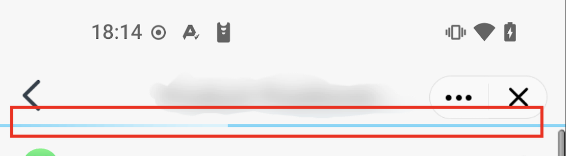
隐藏 Loading 页面的胶囊按钮
默认小程序加载页面,右上角会有胶囊按钮展示,可以通过重写 AbsMiniUiProxy 的 hideLoadingCapsule 方法控制胶囊按钮的隐藏和显示。
胶囊按钮示意图:
API说明:返回值为 true 表示隐藏 Loading 页面的胶囊按钮,false 表示不隐藏(默认值)。
/**
 * 是否隐藏小程序加载loading页面右上角胶囊
 *
 * @return true:隐藏;false:不隐藏(默认值)
 */
boolean hideLoadingCapsule();
定制 webview 组件进度条
webview 组件加载页面时会有进度条展示,默认展示效果如下图:
SDK提供了webview组件进度条定制功能,具体情参考下文。
1. 隐藏 webview 组件进度条
重写 AbsMiniUiProxy 的 hideWebViewProgressBar方法,来控制是否隐藏进度条
/*** 是否隐藏webview组件进度条* @return true:隐藏;false:不隐藏(默认值)*/boolean hideWebViewProgressBar();
2. 设置webview组件进度条颜色
重写 AbsMiniUiProxy 的 webviewProgressBarColor 和 webviewProgressBarBgColor 方法,来控制进度条颜色
/*** 设置webview组件进度条颜色(已完成进度颜色),返回空使用默认值* @return 进度条颜色值,例如:Color.GREEN*/Integer webviewProgressBarColor();/*** webview组件进度条背景色(未完成进度颜色),返回空使用默认值,webviewProgressBarColor返回非空值时生效* @return 进度条背景颜色值,例如:Color.GREEN*/Integer webviewProgressBarBgColor();
定制通用对话框
Supperapp可以通过重写下列接口来实现自定义风格的对话框。
/*** 通用对话框定制接口* @param context 对话框上下* @param dialogInfo 对话框信息* @return 返回自定义的对话框*/Dialog createCommonDialog(Context context, DialogInfo dialogInfo);
示例代码:
@Overridepublic Dialog createCommonDialog(Context context, DialogInfo dialogInfo) {AlertDialog dialog = new AlertDialog.Builder(context).setView(com.tencent.tmfmini.sdk.R.layout.mini_sdk_custom_dialog_temp).create();dialog.setTitle(dialogInfo.getTitle());dialog.setMessage(dialogInfo.getMessage());if (dialogInfo.getPositiveButtonColor() != null) {dialog.setButton(DialogInterface.BUTTON_POSITIVE, dialogInfo.getPositiveButtonText(), dialogInfo.getPositiveButtonListener());}if (dialogInfo.getNegativeButtonColor() != null) {dialog.setButton(DialogInterface.BUTTON_NEGATIVE, dialogInfo.getNegativeButtonText(), dialogInfo.getNegativeButtonListener());}dialog.setCancelable(dialogInfo.isCancelable());dialog.setOnCancelListener(dialogInfo.getCancelListener());dialog.setOnDismissListener(dialogInfo.getDismissListener());return dialog;}
文档反馈