Tencent Cloud Super App as a Service
- Release Notes and Announcements
- Purchasing Guide
- Plan Management
- Branded Configurations
- Introduction to Platform Functions
- Commercialization
- Virtual Payment
- Guidelines for Code Integration
- Android
- Android SDK Description
- Android API
- Mini Program Management APIs
- Custom Mini Program Capabilities
- Custom SDK Capabilities
- iOS
- iOS SDK Description
- iOS API
- Mini Program Management APIs
- Customize Mini Program Capabilities
- Customised SDK Capabilities
- Flutter
- Flutter SDK Description
- Flutter API
- Mini Program Management API
- Mini Program Capabilities Customization
- Plugin Customization
- App Server
- Payment Development Notes
- Mini Program Payment: Parameter Application and Configuration
- Mini Game Payment: Parameter Application and Configuration
- Mini Program Payment: Signature and Verification
- Guildlines for Mini Program Development
- Mini Program Code Composition
- Guidance
- Learn About Mini Programs
- Configuring Mini Program
- Mini Program Framework
- Basic Competencies
- Open Capabilities
- Framework
- Mini Program Configuration
- Framework Interface
- WXML Syntax Reference
- WXS Syntax Reference
- Components
- API
- Interface
- Media
- Device
- JS SDK
- IDE Operation Instructions
- Guildlines for Mini Game Development
- Guide
- Game Engine
- Basic Capability
- Open Capabilities
- API
- Interface
- Rendering
- Device
- Practice Tutorial
- API Documentation
- Making API Requests
- User Management APIs
- Team Management APIs
- Sensitive API-Related APIs
- Role Management APIs
- Platform Management APIs
- Other Console APIs
- Mini Program APIs
- Management-Sensitive APIs
- Global Domain Management APIs
- Application APIs

DocumentationTencent Cloud Super App as a ServiceGuildlines for Mini Program DevelopmentFrameworkMini Program ConfigurationGlobal Configuration
Global Configuration

Last updated: 2025-03-20 18:01:55
The
app.json file in the root directory of the mini program is used for global configuration of the mini program. The file content is a JSON object with the following parameters:Configuration item
attribute | type | required | describe |
string | no | Mini Program default start home page | |
string[] | yes | Page Path List | |
Object | no | Global default window representation | |
Object | no | BOTTOM tab Column performance | |
boolean | no | Whether or not to open debug Mode, off by default | |
Object[] | no | Subcontract structure configuration | |
string | no | Worker Directory for code placement | |
string[] | no | ||
Object | no | Subcontract Predownload Rules | |
Object | no | ||
Object | no | Small Program Interface Permissions Related Settings | |
boolean | no | Mini Program support DarkMode | |
string | no | ||
boolean | no | Whether to disable the side swipe gesture to close the mini program. The default value is false. | |
string | no | Used for API version control (e.g., wx.login); if not configured, the latest version is called by default. |
entryPagePath
Specifies the default startup path (homepage) of the mini program. If left blank, it will default to the first item in the pages list. Page path parameters are not supported.
{"entryPagePath": "pages/index/index"}
pages
Specifies the pages that make up the mini-program, with each item corresponding to the path (including the filename) of a page. No need to include file extensions; the framework will automatically find and process the .json, .js, .wxml, and .wxss files.
If entryPagePath is not specified, the first item in the array represents the initial page (home page) of the mini-program.
To add/remove pages in the mini program, you need to modify the pages array.
For example, if the development directory is:
├── app.js├── app.json├── app.wxss├── pages│ │── index│ │ ├── index.wxml│ │ ├── index.js│ │ ├── index.json│ │ └── index.wxss│ └── logs│ ├── logs.wxml│ └── logs.js└── utils
You need to app.json Middle write
{"pages": ["pages/index/index", "pages/logs/logs"]}
window
Sets the status bar, navigation bar, title, and window background color of the mini-program.
attribute | type | default value | describe |
navigationBarBackgroundColor | HexColor | #000000 | Navigation bar background color, such as #000000 |
navigationBarTextStyle | string | white | Navigation bar header color, support only black / white |
navigationBarTitleText | string | - | Navigation Title Text Content |
navigationStyle | string | default | Navigation bar style supports only the following values default Default Style custom Customize the navigation bar, leaving only the capsule on in the upper right corner. See note 2. |
backgroundColor | HexColor | #ffffff | The background color of the window |
backgroundTextStyle | string | dark | Pull down loading Style, only supports dark / light |
backgroundColorTop | string | #ffffff | The background color of the top window, only iOS Support |
backgroundColorBottom | string | #ffffff | The background color of the bottom window, only iOS Support |
enablePullDownRefresh | boolean | false | |
onReachBottomDistance | number | 50 | The distance from the bottom of the page when the event is triggered, in px.
See for details Page.onReachBottom |
customNavigateBack | Boolean | false | Whether or not you want to intercept the default return of the page (tabBar return or side-swipe or back key return) is used in conjunction with Page.onCustomBack. |
pageOrientation | string | portrait | Screen rotation settings, support car / portrait / landscape
See for details Response to display area changes |
notes 1: HexColor (hexadecimal color value), such as "#ff00ff".
notes 2: For
navigationStylenavigationStyle only takes effect in app.json.navigationStyle: custom does not work for the web-view componenttabBar
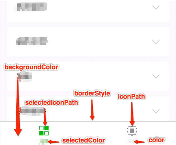
If the mini program is a multi-tab app (with a tab bar at the bottom or top of the client window for switching pages), you can use the tabBar configuration to define its appearance and the pages shown when tabs are switched.
attribute | type | required | default | describe |
color | HexColor | yes | - | tab Default color for text on, only hexadecimal color is supported |
selectedColor | HexColor | yes | - | tab Supports hexadecimal colors only |
backgroundColor | HexColor | yes | - | tab Supports only hexadecimal colors |
borderStyle | string | no | black | Tabs The color of the top border, Support only black / white |
list | Array | yes | - | tab For a list of list Property explaination, minimum 2 Most 5 individual tab |
position | string | no | bottom | tabBar Only supports the location of bottom / top |
custom | boolean | no | false |
When a list accepts an array, 2 to 5 tabs can be configured. The tabs are sorted in the order of the array, and each of them is an object with the following parameters:
attribute | type | required | introductions |
pagePath | string | yes | Page path, must be in the pages First definition |
text | string | yes | tab Up on text |
iconPath | string | no | Picture path, icon Size limit is 40kb, recommended size 81px * 81px, does not support web pictures.
when position for top Does not display when icon. |
selectedIconPath | string | no | Selected picture path, icon Size limit is 40kb, recommended size 81px * 81px, does not support web pictures.
when position for top Does not display when icon. |
debug
You can enable the
debug mode in the developer tool. In the console panel, debug information will be provided as info, including details on page registration, page routing, data updates, and event triggers. It helps developers quickly troubleshoot some common problems.subpackages
Note:
SubPackages is also supported.
workers
navigateToMiniProgramAppIdList
When the mini program needs to call the API to redirect to other mini programs, it is necessary to declare the list of up to 10 appId in the configuration file.
preloadRule
usingComponents
Custom components declared in
app.json are considered global custom components and can be used directly in pages or custom components within the mini program without further declaration. It is recommended to only declare custom components that are used by almost all pages.Note:
Global custom components will be considered dependencies for all pages and will be initialized when any page starts, affecting the startup performance and occupying the main package size. Custom components that are only used by specific pages or sub-packages should be declared in the page configuration whenever possible.
permission
Mini program API permission settings The field type is
Object. Its structure is as follows:attribute | type | required | default | describe |
scope.userLocation | PermissionObject | no | - | Location-dependent permission statement |
Permission Object structure
attribute | type | Required | Default | Introductions |
desc | string | yes | - | Description of the Chinese usage of the interface displayed by the mini program when obtaining permissions. Maximum 80 characters |
desc-en | string | no | - | Description of the English usage of the interface displayed by the mini program when obtaining permissions. Maximum 80 characters |
desc-adesc-ar | string | no | - | A description of the Arabic usage of the interface displayed when the mini program gets permissions. Maximum 80 characters |
Such as:
{"pages": ["pages/index/index"],"permission": {"scope.userLocation": {"desc": "Your location information will be used to display the effects of the Mini Program location interface." // Continuous Background Positioning for Freeway Driving}}}
scope list
scope | API | Description |
scope.userinfo | wx.getUserInfo | User information |
scope.userLocation | wx.getLocation | Get location information |
scope.userFuzzyLocation | wx.getFuzzyLocation | Get fuzzy location information |
scope.record | live-pusher component or wx.startRecord | live-pusher component or wx.startRecord |
scope.camera | camera component | camera component |
scope.addPhoneCalendar | wx.addPhoneCalendar | Add Calendar |
scope.writePhotosAlbum | wx.saveImageToPhotosAlbum | Save Image to Photos Album |
scope.bluetooth | wx.openBluetoothAdapter | Bluetooth |
darkmode
By setting
"darkmode" to true, you can enable dark mode in the mini program. All basic components will display different default styles according to the system theme, and the navigation bar and tab bar will also automatically switch according to the developer's configuration.{"darkmode": true}
themeLocation
The path to the custom theme.json. This configuration file is required when
"darkmode": true is set.disableSlideCloseGesture
Whether to disable the side swipe gesture to close the applet. The default value is false.
apiVersion
Used for API version control (e.g., wx.login); if not configured, the latest version is called by default.
{"apiVersion": "v1"}
Configuration example
{"pages": ["pages/index/index", "pages/logs/index"],"window": {"navigationBarTitleText": "Demo"},"tabBar": {"list": [{"pagePath": "pages/index/index","text": "index"},{"pagePath": "pages/logs/logs","text": "logs"}]},"debug": true}
Was this page helpful?
You can also Contact Sales or Submit a Ticket for help.
Yes
No