Tencent Cloud Super App as a Service
- Release Notes and Announcements
- Purchasing Guide
- Plan Management
- Branded Configurations
- Introduction to Platform Functions
- Commercialization
- Virtual Payment
- Guidelines for Code Integration
- Android
- Android SDK Description
- Android API
- Mini Program Management APIs
- Custom Mini Program Capabilities
- Custom SDK Capabilities
- iOS
- iOS SDK Description
- iOS API
- Mini Program Management APIs
- Customize Mini Program Capabilities
- Customised SDK Capabilities
- Flutter
- Flutter SDK Description
- Flutter API
- Mini Program Management API
- Mini Program Capabilities Customization
- Plugin Customization
- App Server
- Payment Development Notes
- Mini Program Payment: Parameter Application and Configuration
- Mini Game Payment: Parameter Application and Configuration
- Mini Program Payment: Signature and Verification
- Guildlines for Mini Program Development
- Mini Program Code Composition
- Guidance
- Learn About Mini Programs
- Configuring Mini Program
- Mini Program Framework
- Basic Competencies
- Open Capabilities
- Framework
- Mini Program Configuration
- Framework Interface
- WXML Syntax Reference
- WXS Syntax Reference
- Components
- API
- Interface
- Media
- Device
- JS SDK
- IDE Operation Instructions
- Guildlines for Mini Game Development
- Guide
- Game Engine
- Basic Capability
- Open Capabilities
- API
- Interface
- Rendering
- Device
- Practice Tutorial
- API Documentation
- Making API Requests
- User Management APIs
- Team Management APIs
- Sensitive API-Related APIs
- Role Management APIs
- Platform Management APIs
- Other Console APIs
- Mini Program APIs
- Management-Sensitive APIs
- Global Domain Management APIs
- Application APIs

DocumentationTencent Cloud Super App as a ServiceGuildlines for Mini Program DevelopmentComponentsNavigation Component
Navigation Component

Last updated: 2024-11-27 18:07:22
navigator
Feature description:Page URL.
Parameter and description:
Property | Type | Valid values and description | Default value | Required | Description |
target | string | self: The current mini program miniProgram: Other mini programs | self | False | Specifies the target for the navigation. Default is the current mini program. |
url | string | - | - | False | URL for navigation within the current mini program. |
open-type | string | navigate: Corresponds to the feature of wx.navigateTo or wx.navigateToMiniProgram redirect: Corresponds to the feature of wx.redirectTo switchTab: Corresponds to the feature of wx.switchTab reLaunch: Corresponds to the feature of wx.reLaunch navigateBack: Corresponds to the feature of wx.navigateBack exit: Exits the mini program. Effective when target="miniProgram" | navigate | False | Specifies the navigation method. |
delta | number | - | 1 | False | Effective when open-type is 'navigateBack', indicates the number of layers to go back. |
app-id | string | - | - | False | Effective when target="miniProgram" and open-type="navigate", specifies the appId of the mini program to open. |
path | string | - | - | False | Effective when target="miniProgram", specifies the page path to open. If empty, opens the home page. |
extra-data | object | - | - | False | Effective when target="miniProgram", specifies data to pass to the target mini program. The target mini program can retrieve this data in App.onLaunch()andApp.onShow() . |
version | string | develop: The development version trial: The Preview release: The released version. This property is valid only when the version of the mini program is the development version or Preview. If the current mini program version is released, the version of the mini program to be opened must be the released version. | release | False | Effective when target="miniProgram" and open-type="navigate", specifies the version of the mini program to open. |
hover-class | string | - | navigator-hover | False | Specifies the style class when tapped. If hover-class="none", there is no tap effect. |
hover-stop-propagation | boolean | - | false | False | Specifies whether to prevent ancestor nodes from showing the tap effect. |
hover-start-time | number | - | 50 | False | Time in milliseconds before the tap effect appears after pressing. |
hover-stay-time | number | - | 600 | False | Time in milliseconds the tap effect remains after the finger is released. |
bindsuccess | string | - | - | False | Effective when target="miniProgram", triggered when navigation to the mini program is successful. |
bindfail | string | - | - | False | Effective when target="miniProgram", triggered when navigation to the mini program fails. |
bindcomplete | string | - | - | False | Effective when target="miniProgram", triggered when navigation to the mini program is complete. |
Restrictions:User confirmation is required for navigation.
Before navigating to another mini program, a pop-up will appear asking for user confirmation. Navigation will proceed only if the user confirms. If the user cancels, the
fail cancelwill be triggered.Notes:
navigator-hoverdefaults to{background-color: rgba(0, 0, 0, 0.1); opacity: 0.7;}, The background color of the child nodes of <navigator>should be transparent.Example:
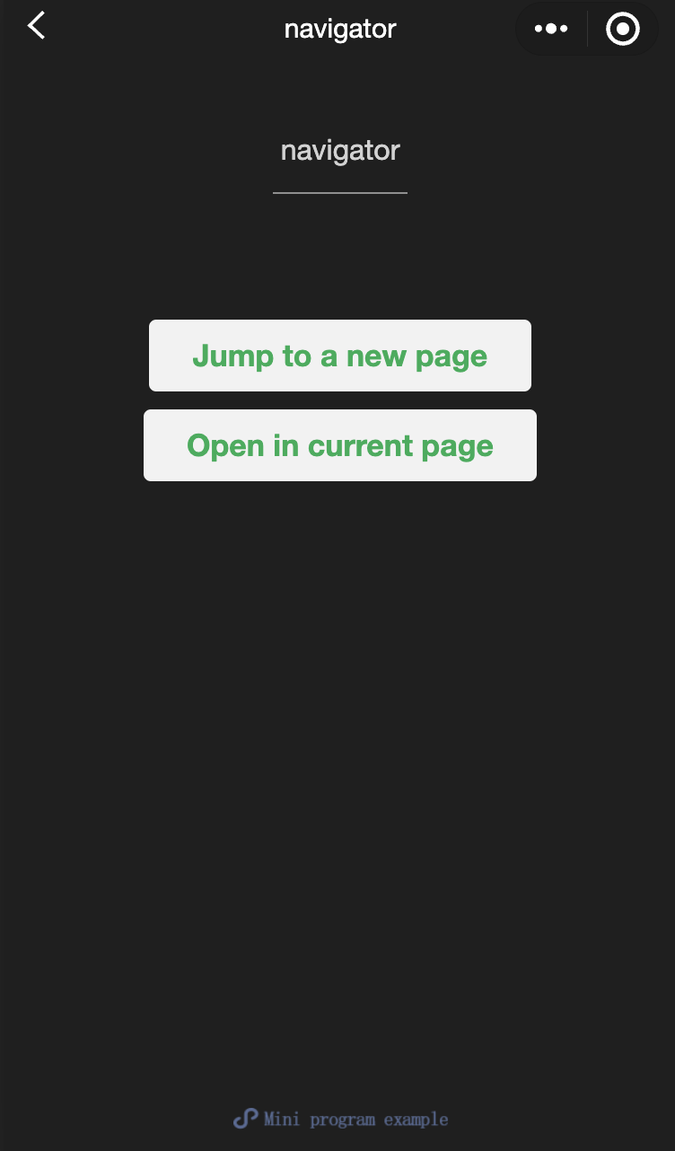
<view class="btn-area"><navigatorurl="/page/navigate/navigate?title=navigate"hover-class="navigator-hover">Navigate to a new page.</navigator><navigatorurl="../../redirect/redirect/redirect?title=redirect"open-type="redirect"hover-class="other-navigator-hover">Open on the current page.</navigator></view>
<view style="text-align:center"> {{title}} </view><view> Tap the top left corner to return to the previous page. </view>
<view style="text-align:center"> {{title}} </view><view> Tap the top left corner to return to the parent page. </view>
Page({onLoad: function(options) {this.setData({title: options.title})}})
/** wxss **//** Modify the default tap effect of navigator. **/.navigator-hover {color: blue;}/** Customize the style classes for other tap effect. **/.other-navigator-hover {color: red;}
Was this page helpful?
You can also Contact Sales or Submit a Ticket for help.
Yes
No